International Holocaust Film Series (IHFS)
This project a three part series, which involved the creation of a branding and design system for the International Holocaust Film Series, an existing brand. The primary objective was to construct a visual identity that emphasize the individuals affected by the Holocaust, steering away from the darker themes typically associated with this historical event.
To adhere to the specified guidelines, the design intentionally avoided the use of the color red, encouraging a palette that resonates with positivity and growth.
In summary, the branding for the International Holocaust Film Series not only aims to respect the solemnity of the subject matter but also to inspire reflection and dialogue about the individuals.


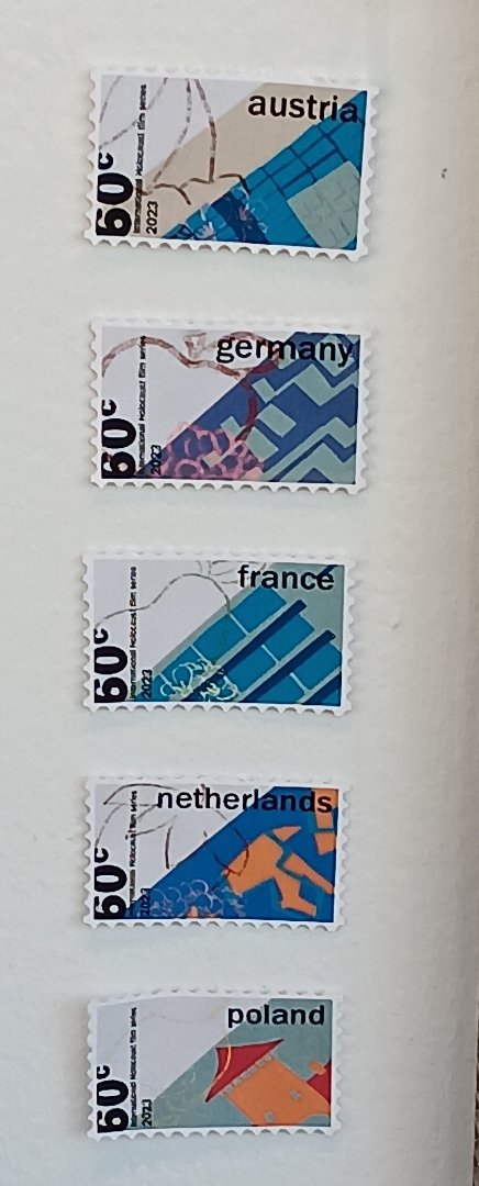
Posters and stamps from the series
The project commenced with the design of three posters, centered around the theme of a playground. This choice serves to emphasize the sense of community among families and children impacted by the Holocaust. A playground symbolizes a space for families to come together, fostering unity and connection.
To enhance the emotional resonance of the posters, I incorporated cut-up pieces of paper, mirroring the handcrafted creations typical of a child's artwork. This technique not only added a personal touch but also evoked nostalgia and innocence.
The designs were then scanned, with these digital, they utilized as the backdrop for the posters. This approach allowed the typography to interact seamlessly with the playground equipment depicted.


In the stamp design, we were tasked with creating a series of stamps for five different countries. I opted for a mixed media approach, again, utilizing cut-up paper as the foundational background, integrating Holocaust memorials from these nations, acknowledging their historical significance. To enhance the visual impact, I incorporated additional elements, including illustrations of each country's national fruit alongside its corresponding flower. This thoughtful combination of elements aims to celebrate national identity while also honoring important cultural memories.


For the logo, I opted for a design inspired by a film festival ticket. The lowercase “I” is crafted in a rectangular shape to represent the indent created when a ticket is detached from its stub. Utilizing the Helvetica typeface ensures a clean and crisp aesthetic, aligning with the overall theme and other typefaces employed throughout the series. This design decision not only embodies the essence of the film festival experience but also maintains a cohesive visual identity.


